Learning the basics of magazine layout with InDesign

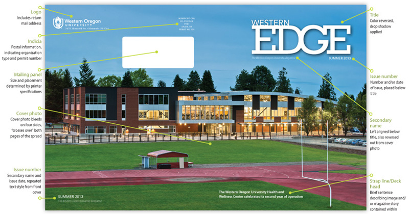
In this tutorial, we'll look at some typical elements of magazine design by focusing on a feature article, and include a few secondary pieces of information that have been supplied to support the article. You'll also see the cover page example in the above photo, which crosses the center of the spread to create the front and back of the magazine. The image above - and also in each of the thumbnails shown below - identifies the common parts of a magazine.
We’ll learn some best practices by creating master pages and using paragraph and character styles as we work with text. Choosing and combining typefaces and images is part of the aesthetic process, and there are many video tutorials on the Web that show creative ways to combine them (See Merging text and images for one such video.) Finally, we’ll preflight our document and export a print-ready PDF.
You can click in the images below to look at each of the interior page spreads we'll be creating as part of this magazine. To follow along with the actual file, download the InDesign document, Links and Fonts folder at: wou.edu/~visuanod/magazine_layout/western_edge/


