Working with images: captions
(InDesign: go to the third interior page spread in the magazine to follow along with this example.)
 It's always good practice to provide a caption for the photos placed within a story. It's a place to identify what the image is about, and give credit to the photographer. In some cases, such as a magazine of this type, photographer credit has been given in the credits section at the front of the issue.
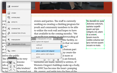
The captions in this article sit in the far left and far right narrow columns created at the beginning of this lesson. To aid as a visual reference, this caption area at left has been filled with placeholder text. It is the job of the editor, typically, to provide the copy for those areas of content.
To do this with temporary "text," create a text frame, then with the text tool active - with the cursor blinking inside that text frame, to to Type > Fill with Placeholder Text. It's just that easy - the trick is remembering to go back and make sure the real text is put in place later!
Next: Having some fun with design: merging text and images to create different effects


